Overview
Problem
B2B clients could only order via phone/email; sales reps re-entered everything into Exact Online. Slow, error-prone, and zero visibility for customers (pricing, invoices, spend, promotions).
Outcome
A secure B2B portal with customer-specific pricing, assigned payment methods, order/invoice access, and a promotions hub. Orders sync to Exact Online every 15 minutes via Make.com.
Client
The Health Factory
Dutch health & wellness company specializing in mineral- and oxygen-based supplements, serving recurring B2B clients across Europe.
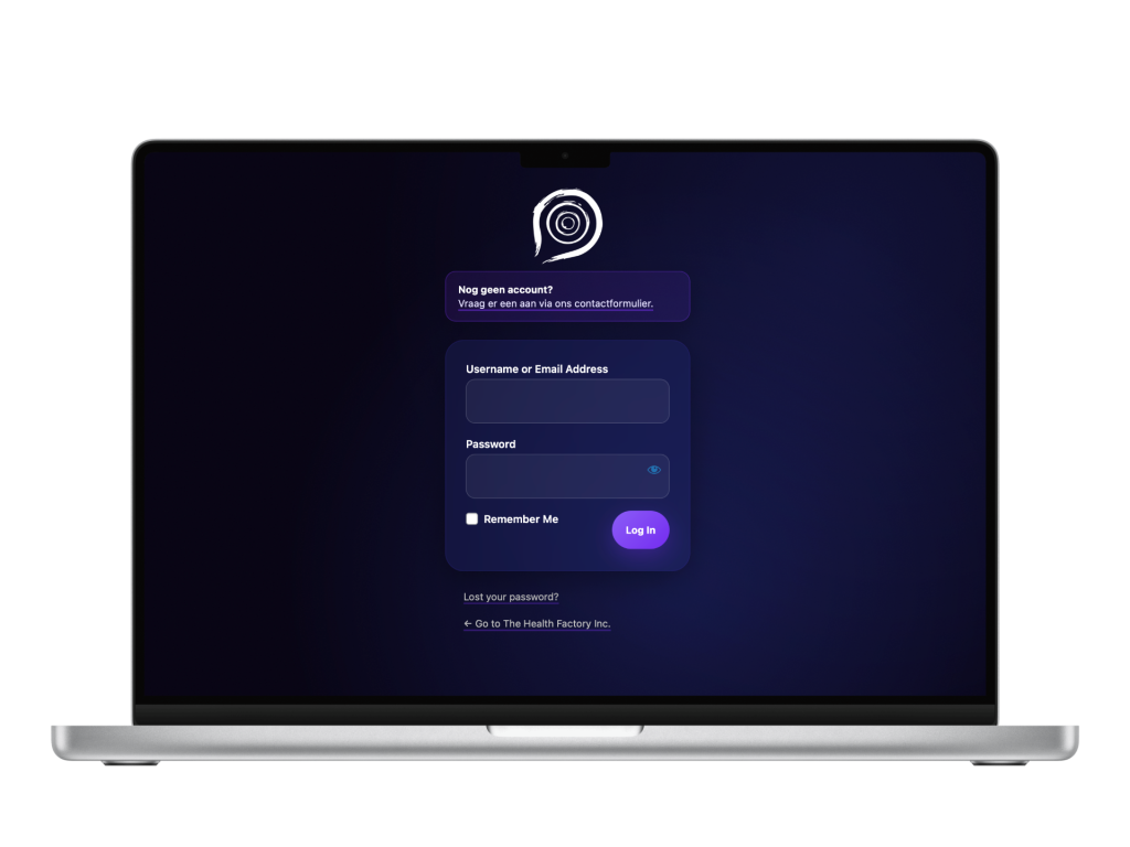
The B2B portal is customer-only and sits behind login, so it isn’t publicly accessible.
You can still see my work on the public site for The Health Factory, which I built.
Info
Role
Product Designer & Developer (research → flows → build → automation)
Team
Independent project with client stakeholders
Timeline
3 months
understanding the problem
Why this project?
While working at The Health Factory, I saw reps re-typing 100% of orders. I proposed a self-service portal that shows each customer their contract pricing and pushes orders straight into Exact Online.
1
Manual processes
Orders had to be re-entered into Exact Online, wasting time and creating errors. Customers couldn’t view past orders, invoices, or total spend.
2
Missed promotions
Quarterly offers weren’t consistently communicated by sales reps.
3
Complex B2B pricing
Each customer had unique pricing agreements, but these weren’t reflected online.
Discovery
Understanding the current experience
Ordering was slow and hid value, with phone and email leading to manual re-entry, errors, no self-service, and missed promotions. Because many customers are older business owners (60+), the interface needed to be effortless and highly legible.
Essentials first
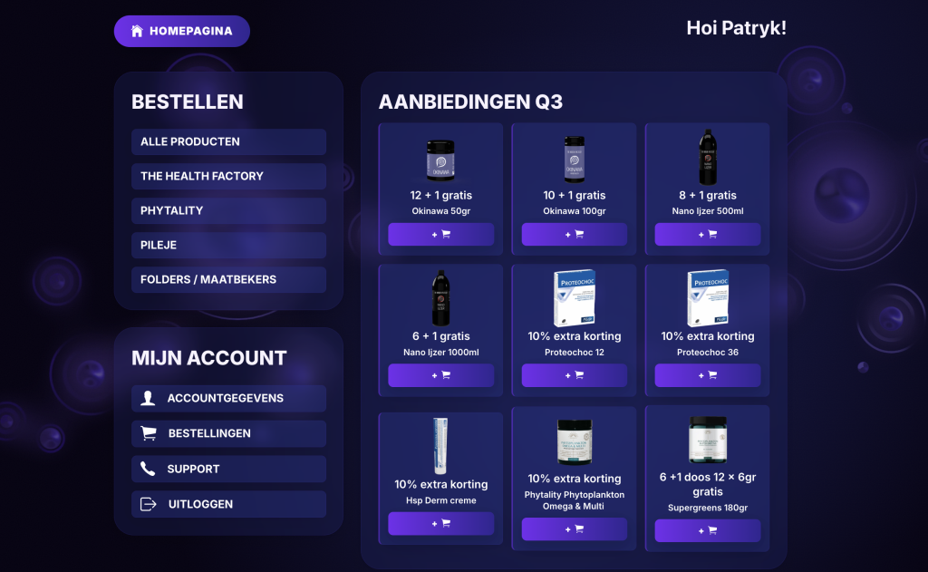
access to everything from the main page, no submenus, dead simple to navigate.
Familiar patterns
mean a classic product, cart, and checkout flow with predictable fields and placements.
Readable UI
larger type, high contrast, generous spacing, on brand.
Pricing
show contract price and assigned payment by default.
What I built
Main page
Quarterly offers are the first thing customers see, with quick add-to-cart. No submenus- everything is reachable from the homepage.
What I built
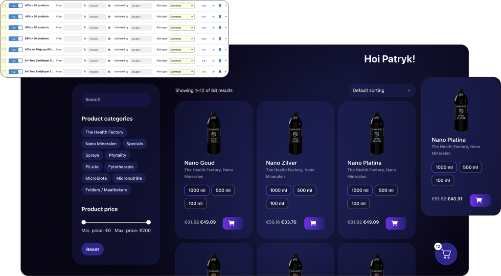
Product catalogue
Each customer sees their contract pricing and only the relevant variants (content/size swatches) per their agreement. Pricing and terms are visible on product, cart, and checkout.
What I built
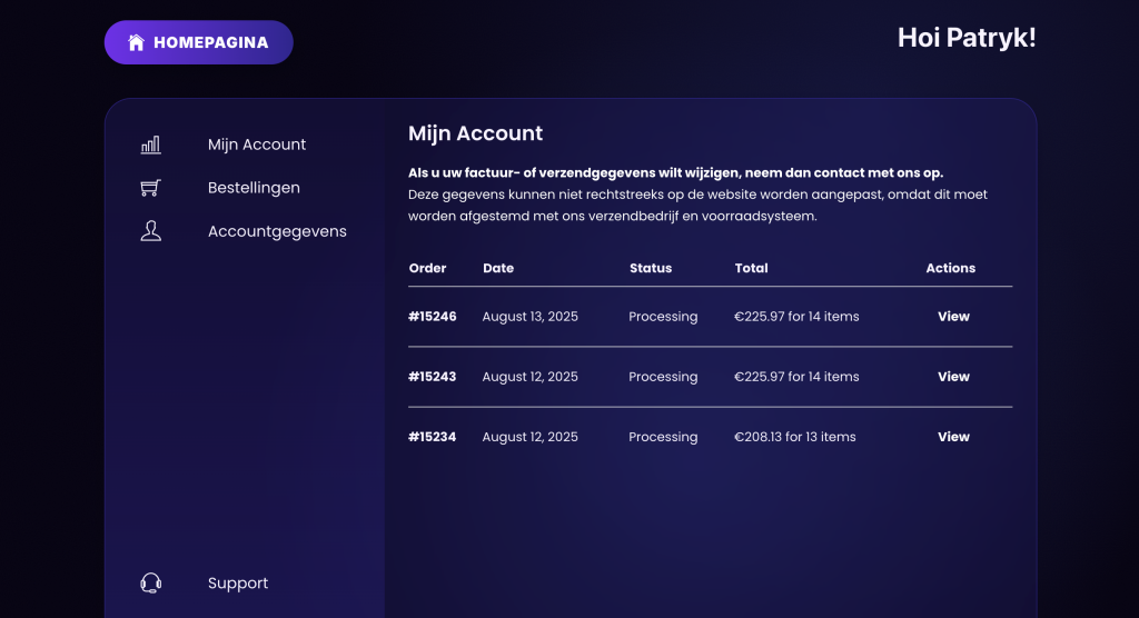
Account dashboard
A simple space to view orders, download invoices (PDF), and track total spend- designed for easy scanning by older users.
What I built
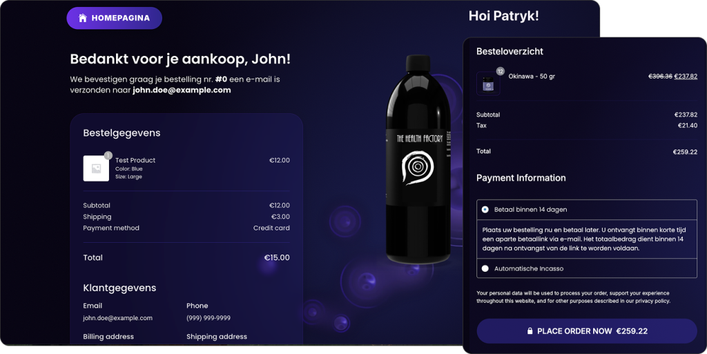
Checkout
The assigned payment method is preselected and clearly shown. Fewer fields, predictable placements, and a clear confirmation screen reduce errors.
What I built
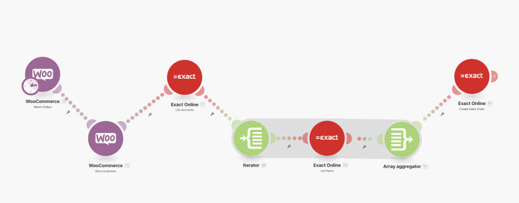
Automation
WooCommerce connects to Exact Online via Make.com. Every 15 minutes the scenario maps customer, lines, and terms to create the sales order in Exact and assigns it to the right account. Failures are logged for quick follow-up.
impact
Evaluating our results
To measure the impact of the new portal, we tracked adoption, error rates, efficiency gains, and support requests. This gave us clear proof of how the changes improved both customer experience and internal operations.
10–12 hours saved per week
Sales reps no longer re-typed orders, freeing time for client-facing work.
Measured via time-tracking and rep interviews.
~90% fewer discrepancies
Automatic sync reduced errors from manual entry.
Measured via Exact Online discrepancy logs and support tickets.
80% customer adoption
Most B2B customers switched to the portal in the first quarter.
Measured via portal logins and order analytics.
+25% promotion uptake
Quarterly offers performed better once highlighted on the homepage.
Measured via campaign order data (pre vs post portal launch).
–40% support requests
Invoice-related tickets dropped as customers downloaded documents themselves.
Measured via support ticket volumes.
1-session checkout
Ordering shifted from back-and-forth emails to a single, predictable flow—especially valuable for older users.
Observed via analytics and qualitative feedback.
Retrospective
What I learned along the way
Practical takeaways from building a portal that balanced business rules, usability, and automation.
Show the rules
In B2B, pricing and payment terms are part of the UX. Make them visible, not hidden.
Automation is UX
Even if it’s invisible, automation builds trust through accuracy and speed.
Design for clarity
Legibility, predictability, and simplicity make adoption smoother for non-technical clients.
Measure
Linking design decisions to adoption, error rates, and support volumes turns outcomes into proof.